Our logo
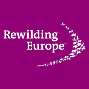
Rewilding Europe’s logo stands as a symbol of innovation and transformative thinking in the realm of nature conservation. Within the logo, an arrow-like formation is formed by the harmonious convergence of plants, animals, and human beings, illustrating their collective movement towards a thriving future.
Additionally, it evokes a sense of abundance, akin to the richness of a thriving ecosystem, and the collective power found within swarms and herds. This design concept echoes the belief that unity is a force greater than the sum of its individual parts, a truth reflected not only in nature but also in corporate identity.
The choice of the colour purple in Rewilding Europe’s logo is a deliberate departure from the traditional colours commonly associated with nature conservation, such as green and blue. Purple, in this context, represents a departure from the norm and signifies the organisation’s determination to bring about change and innovation. It reflects Rewilding Europe’s aspiration to challenge the status quo and bring fresh, innovative approaches to the forefront of the conservation movement.
The visionary logo was designed by Severin Wucher of Plural Berlin together with Theresa Grieben, whose creativity and expertise were instrumental in crafting an emblem that perfectly encapsulates Rewilding Europe’s forward-thinking mission and commitment to reimagining the future of nature conservation.


